

Hi there, we hope everybody here in Japan is able to cope with the cloudy skies and muggy weather that accompany Japan’s rainy season. While the northern Kanto region is seeing a shortage of rain, Kyushu is afflicted by heavy downpours. We are already halfway through this year’s rainy season and so far there haven’t been any major calamities so let’s hope this will continue.
Once the rainy season lifts, summer will go into full effect. Many of you probably have some plans for the summer vacation. According to June’s Climate Watch post we should expect both La Niña and a negative Indian Ocean Dipole to develop. This constellation is very similar to that of the infamous year 2010, which saw the highest number of heat stroke victims in Japan’s history. So please be careful in the heat this summer.
And now we would like to come to the main topic of this post, which is to check how accurate our spring 2016 forecast was. This kind of exercise, often called forecast verification, consists of comparing the conditions (e.g. temperature, rainfall amount) that were forecast for a certain time period with the conditions that actually occurred. Forecast verification is an essential step toward improving forecast accuracy.
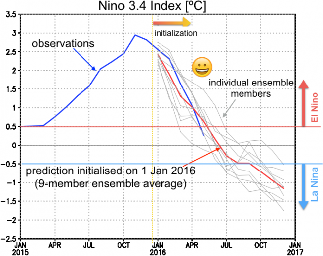
Let’s look at the El Niño forecast first. The figure below shows how the Niño 3.4 index has evolved from January 2015 to present. The Niño 3.4 index is calculated by averaging sea-surface temperature (SST) anomalies over the eastern and central tropical Pacific, and it is one of the most important indicators for the state of the El Niño-Southern Oscillation (ENSO). The blue line shows the Niño 3.4 index as calculated from observations, which we take as our reference. From the spring of 2015, the index climbed steadily until, by the end of that year, it reached levels comparable to the record-breaking El Niño of 1997/1998. From December 2015 onward El Niño started weakening and it finally expired in May 2016. The red line shows the SINTEX-F forecast initialized from January 2016 and it is evident that it tracks the observations rather well. Thus the model achieved an impressive prediction of the demise of this super El Niño. For the second half of 2016, the model predicts La Niña to develop (this was actually already predicted from November 2015; you can check previous forecasts here), and, if temperatures keep decreasing at the current rate, this prediction will be spot on as well (the SINTEX-F model used by APL has been shown to have useful prediction skill for up to two years ahead; see Luo et al. 2008 for details).
(Note: In order to take into account uncertainties that arise from the complexity of natural phenomena, a total of 9 prediction experiments are performed, each with slight changes in the initial conditions and model settings. This technique is called ensemble forecasting. The grey lines in the figure show the results of those individual ensemble members, while the red line is their average. It may seem counter-intuitive but both theoretical arguments and experience show that the ensemble average generally performs better than any of the individual members.)
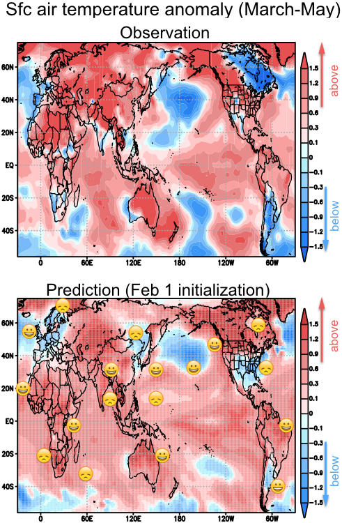
Next, let’s take a look at the surface air temperature anomalies in spring 2016 (i.e. the average over March through May). The upper panel of the figure below shows the observations (more specifically, this is data from the NCEP/NCAR reanalysis project), with red shading indicating warmer than average and blue shading indicating cooler than average temperatures. The lower panel shows the model forecast initialized on 1 February 2016 (so essentially predicting 2-4 months into the future). The forecast is successful in most regions of the globe. For example, the warmer than average temperatures over North Africa, the Middle East, Russia, China, North India, Southeast Asia, Northwest America, northern South America, Australia, and Japan were all correctly forecast by SINTEX-F. The model was also able to predict the cooler than average temperatures over western Europe and southern South America. There are, however, also some regions where the forecast failed, including southwestern Africa (particularly around Namibia), northern Europe, northeast China, southern India, eastern Canada, and the southern and eastern US.
So what is the final verdict? Well, it looks like this prediction was pretty successful and, of course, that’s a great thing. But the purpose of forecast verification is not to pat yourself on the back. In order to improve our forecast model we have to check where the predictions failed and for what reasons. We want to ask, was a certain event predictable? How can we improve our forecast model to be able to predict such events in the future? Based on questions like these we will continue research on how to further improve our forecasts.